Watercolours by Edo Hannema
Let the water be your guide
zondag 30 mei 2021
zaterdag 15 september 2018
Wieringen
zaterdag 30 juni 2018
Alvaro Castagnet
Every watercolor artist knows him, well I think you should know him if you are interested in watercolor. He is quite a phenomenon in watercolor. His work is very recognizable and full of rich washes with pigment. But behind all that color is a artist mind, that unconscious makes designs and layout in his painting. Well unconscious...., he just paints a lot, and gives many workshops. And its weird but true, from teaching people that can't paint so well as yourself, you learn a lot too.
How many do not stare at their watercolor on a certain stage, and say to them self's how must I do that foreground without ruining the rest of my careful brushed painting. Or they are finished and ask them self what is missing. What part can I add to my watercolor that it becomes better and more of a eye-catcher. Well you are to late! The design must be done before you start, the design and layout must be ready before the first brushstrokes.
But..watercolor is unpredictable and just going a other way then you want it to go, then you must have enough skills to follow your watercolor. its got no use to going against it!!
Keep the design intact, cause that is a part that works, its also why many artist make little thumbnail sketches, or a more worked out watercolor-sketch.
Design is something you can learn, to study paintings, what are the lines, why is it work, why is it I keep looking, why does this painting attract me so much?
This week my eye fell on a painting from Alvaro Castagnet, it is a very clever one made.
His brilliant design works here on his best!
The feature that stands out obviously is of course the turquoise roof, from there you are follow the only sharp object on that height, and you land on the second turquoise roof, much smaller but it stands out well, nothing more to see there then blurry shapes but then the light building on the left catch your attention, and the shadow helps you to travel to the street below with zebra-paths and a few cars, people and a red traffic-sign, the small green dots of color leads you to a lighter big green shape that you follow to the other corner, very clever, in that corner is completely nothing. Only shade and darkness. He don't want you to look there!! He made it easy, there is a sort of stairs of windows you climb to the light above, you jump over to the roof on the right, and that roof is directing you exactly where he wants you to look, the green round roof again! Full circle and you stay focused in the painting.
This is how I see it, there are many ways, and maybe Alvaro thought about it, but I think its more the talent and instinct of Alvaro self. He just paint, and brush down what is necessary to make it work and with a beautiful design! All on his own feeling!
Learn to look at a painting, and your solution what must or what can I do will improve your own work too.
This is one way to look on a painting, and why the painting is working, there are a lot of methods, Edgar A Whitney, Tony Couch and Tony van Hasselt have created systems to value your watercolor on what is missing and what you could do to improve it.
I never did have the pleasure to follow a workshop with Alvaro, but I have his books and a few of his dvd's to get a glimpse of his magic!
website Alvaro: http://www.alvarocastagnet.net/

Can you see it in this one?
I wished I did have half of his talent, I am still learning, and maybe I never learn.
But I enjoy what I do, as long as you have fun, your on the right way!
Regards Edo
donderdag 28 juni 2018
Painting a Dutch Landscape
I painted this before, and it thought it would be nice to make a movie from it.
Hope you all like it, have fun watching.
If you like it please give me the Thumbs up,
its a new thing for Google for ranking video's on you tube.
The movie is on You Tube in HD video
Thanks in advance!
by Edo Hannema
maandag 25 december 2017
woensdag 8 juni 2016
Aubrey Phillips
I was a novice in watercolor, and I didn’t recognized the sublimity of this painter!
It was in the year 2014, I was looking for John Pike photo's I found a site from the Dutch artist Arie Jekel and when I saw the page from his inspiration I found John Pike, Edward Wesson, Edward Seago and Aubrey Phillips!
- The texture of the paper helps to create the atmosphere. Warm colours in the front cooler colours in the background
- The Cotswolds on a September evening
“When you can do it in less than one brushstroke you are on the right way!” (J. Zbukvic)
Colours : Ultramarine Blue, Cobalt Blue, Monestial Blue*, Cadmium Red, Alizarine Crimson, Burnt Sienna, Burnt Umber, Raw Umber, Raw Sienna, Light Red, Lemon Yellow, and Viridian, nothing more fitted in his paintbox
Brushes; A Hake 2,5 Inch and a 1 Inch flat, Nr 14 Sable round, nr 11 and 8 Sable round and a rigger nr 4
Websites
Arie Jekel
- Monestial Blue is Phtalo Blue, Rembrandt Blue or Winsor Blue
Click the link below
"brushes with watercolour"
woensdag 11 februari 2015
Thinking out of the box.
When you have a landscape on a photo and you like to paint this, and make this in a watercolor, the changes are big you copy every line and color on that photo, and will end up with a boring watercolor comparing to the photo.
You have to make changes in your painting that makes it a charming watercolor.
One thing you can do is make the colors and shapes more simple, looking to your eyelashes and discover the big lines in the scene. You could make a B&W photocopy, in that way you can make up your own colors. Take three colors close to each other, although they all say with the primary colors you can make every color, to make a unity in your painting those colors are to far apart to make it work.
Let see we take a photo from a landscape!
Nice one hey!! Great sky, nice reflections! just enough land to make it work!
This what I made of it. its tranquil, but also not a very exciting picture.
But I know it is not horrible, but it is copy from what is there.
Cobalt Blue, Auroliën Yellow and Burnt Sienna are the colors for a scene above.
So the red is in this case Burnt Sienna.
Now we must think, what can we do more, we have sky and water, and a bit of land!
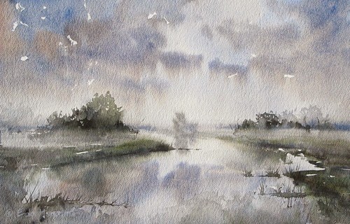
Lets make a fog, and a bit of a misty scenery. Maybe I must have chosen a smoother paper, but I did paint it on rough Saunders Waterford.
I used Ultramarine Blue, Burnt Sienna, Olive Green, and a bit of Neutral tint!
You see its in harmony, just like the one before, cause I use just a few colors.
Neutral tint is good to make a color darker, but not dirtier!
After the misty scene I was convinced I could do one more, well I could go forever, cause you can make endless mixes with color, and every painting would look different.
Take other paper, use other brushes, every time you change something, the outcome will be different!
So I looked at my brushes, and there are a few flats, from three inch to just a quarter Inch.
My next painting will be made only with these! And I going to use fresh colors, so no red holding blues!
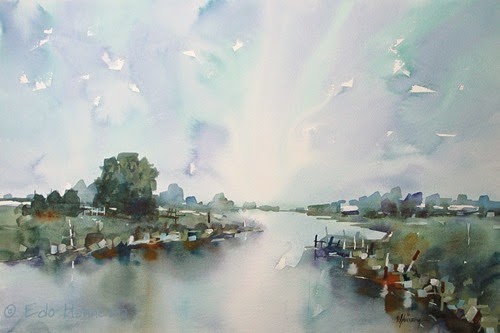
So in this one I used Winsor Blue, Sap-green, Cobalt Violet, and Raw and Burnt Sienna.
Immediately you can see the difference, this is fresher, and more colorful!
But still in Harmony, cause the big washes, are just three colors!
Note:
I didn’t looked at the photo for the last two watercolors , just made them by memory!
Just painting what is good for the watercolor, not looking for what is there, makes more interesting pictures!
Try to make a few watercolors from one subject, you can change colors, but also change the horizon lower or higher, or make this landscape with the paper on a different angle.
These were done all the same with the paper in landscape mode.
But you can also make this with the paper in portrait mode!
Good luck, but most of all have fun!!
Edo
vrijdag 5 september 2014
Kees van Aalst
Kees van Aalst is a Dutch Watercolormaster.
Watching Kees van Aalst paint, is watching a skilled artist paint.
It looks so easy when you see it, but when you try it, you end up with a painting that looks like your little brother have made! Why is that?
40 years experience for a start, and he made this style of painting completely his own, its like a handwriting, you can try to copy this style, and you will succeed with something that looks like his, but you will miss the finesse and power in the more then resolute brushstrokes.
All his painting career he makes “Less is More” a fact, and makes even less, more less!
Suggestion and abstraction of scenes and objects are the main drive he will put in his paintings. Not only he use watercolor, but also Bister (made from Walnut shells) and diluted watercolor pigment, brought on the paper with a sharpened matchstick is part of his technique.
Large washes in the start, with fresh colors, usually with no more then three pigments.
Before he paints the subject, he choose what mood he wants in the watercolor.
And then he choose his colors.
In the workshops I followed, Kees made 6 or more examples what colors you can choose, and even just as much pencil thumbnails for contrast and tone. They are not complete paintings, but just quick notes for color and you can just discover the subject.
Kees always teach, you must not paint a boat, but people have to look at your art and say “hey that looks like a boat!”
The first wash was light and Kees kept a few whites on the paper, he saw a industrial scene in it, so his second wash he made the industry coming a bit more forward.
If you see mountains after your first wash, paint the mountains, its your imagine, and your art!
After that he will refine a second wash, with the same pigments, only stronger, and after drying he finish with detailed marks, these marks are not just put down randomly, but make the viewer look, where Kees want him to look. I know for a start that these last details are the though ones, you have absolute no clue where to put them. After practicing and lots of failures I start to know how. (a bit).
But for Kees its like writing his name down, Tjak Tjak he says often, and there it is! Small dots of pigment, stripes wide and narrow, brushed down with a rigger or matchstick all in the right place.
Don’t make the mistake it looks easy, but it isn't! All dots and stripes are highly visible, so a wrong one will stand out big!
These latest demos were published in the Dutch art magazine “Palet”
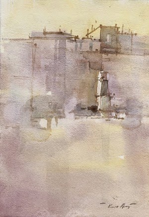
The above is sort of a Italian Piazza, the yellow glow, and purple haze makes you think of the Mediterranean. With a sharp matchstick Kees made some marks to give the idea from houses and a pillar in the middle. Then some accents in a cool color to give shadow-sides and variation on the buildings and all ready again! Less is More is so true here!
A small demo Kees made on one of his workshops.All was done in 10 minutes or less.
Don’t paint pictures, paint tones, shadows and moods. Paint to paint, not to make the best painting ever, but paint to enjoy yourself!
Edo Hannema
All photos on this website are copyrighted material and all rights are reserved.
zaterdag 16 augustus 2014
Chien Chung Wei
Soms, heel soms kom je een schilder tegen die virtuozer is dan alle andere schilders,
zo iemand is Chien Chung Wei, een leraar teken en schildertechnieken in Taipei Taiwan.
Iedere penseelstreek is raak, en vol kleur, texturen en zachte overgangen,
witten worden mooi uitgespaard, maar nooit te opvallend.
Hierboven:
Van warm naar koel, geeft een sfeer van warmte en mist.
Voorgrond hoog in het midden, beide zijdes lager gehouden, en de achtergrond is net andersom.
Dan blijft het boeien! Witte randjes langs de dakranden maakt het levendig, en laat de aquarel sprankelen.
Weer een (reverse) van warm naar koel, let op de daken, bijna alle daken zijn door middel van de achterliggende gedeeltes uitgespaard, behalve de paar helemaal achterin, die een soort silhouet vormen, wat ook weer afstand creëert!
Zelfs plein air is deze artiest geweldig, iedereen weet hoe moeilijk het is om buiten te schilderen.
Laag na laag loop je door de aquarel, alsof je door de coulissen loopt.
Groen is een moeilijke kleur, meestal slaat de kleur neer in een saai vlak, maar Chien Chung Wei laat het van het papier spatten, een prachtige nat in nat achtergrond laat de scherpere vormen mooi afsteken. De donker voorgrond met het kleine huisje creëert ook weer afstand en maakt de aquarel ook weer interessanter.
Een groot deel is koel, daarom steekt het warme gedeelte mooi af, de reflecties zijn summier weergegeven waardoor het niet op sneeuw lijkt maar je weet dat het hier water betreft.
Zo mooi warm, de donkere bomen die als tegenhanger de lichte lucht hebben, de warme voorgrond, met daar weer de koel blauwe lucht, dit schilderij is bijna een Yin Yang teken. Toch moet je dit niet zo opvatten, vaak is een schilder op zoek naar harmonie, en dat bereikt die intuïtief, gewoon omdat die dit aanvoelt, en het een tweede natuur is geworden.
Een stap bij stap voorbeeldserie door Chien Chung Wei
Een eenvoudige tekening is voldoende houvast, hoe meer je tekent, des te meer is het gevaar dat je vakjes gaat invullen, leer vertrouwen in je penseel te hebben, en hou het luchtig in deze fase.
Grote vlakken worden ingevuld en er worden midden-tonen toegevoegd, nog steeds geen details hier!
Bedenk wel de schilder weet precies waar die naar toe wil! Hij heeft het einddoel, net als een schaakgrootmeester in zijn hoofd zitten.
Donkere schaduwpartijen worden aangebracht, en figuren worden uitgespaard, de focus wordt nu duidelijk, hij mist hier nog de inleiding naar het onderwerp.
Details zijn gemaakt, misschien 10% van het geheel maar onmisbaar, het is een grote stap vanaf de vorige fase, maar ook dit is niet te leren, je voegt toe wat nodig is, ook als het er niet is, je aquarel heeft het nodig.
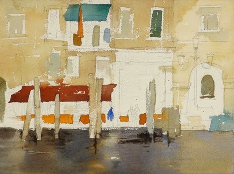
Door middel van de donkere waterpartij, kom je bij het onderwerp aan, via de richting die de figuur op loopt, kom je bij de dukdalf en de lantaarn terecht, via de lantaarn omhoog, en dan weer links via de rand van de poort brengt je bij het balkon. waardoor je oog via de dukdalf eronder weer beneden komt.
Ik weet best dat je zo niet kijkt, maar het gebeurd in een fractie van een seconde, en dat is wat je raakt in een schilderij.
Een schilderij ga je niet na lang kijken mooi vinden, dat gebeurd in de eerste seconden.
Je bent verliefd op slag of niet.
Met dank aan Chien Chung Wei die ik erg bewonder.
Edo Hannema
vrijdag 4 april 2014
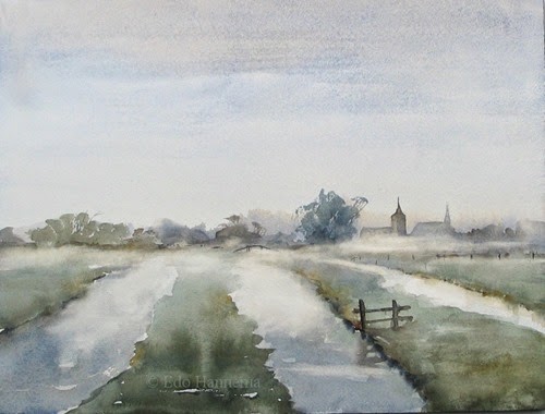
Painting a misty scene Plein Air
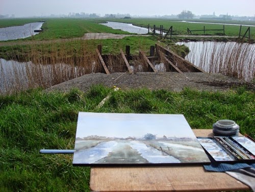
Adrie Hoekstra and myself went painting on location, the weather forecast was sunny all day!
Well it wasn’t really the case in the morning. It was chilly, and I was happy I brought my fleece jacket.
But when we arrived it was a gorgeous view. The mist above the marshes and the churches just appeared on the Horizon!
The first wash was a grey misty color with a yellow touch above the horizon,
so I went for Ultramarine Blue and Burnt Sienna, with loads of water.
Loads of water doesn’t mean loads of water in your brush, make always sure you don’t paint with a blob of water,
but with a solution that comes nice from your brush.
For the touch of yellow in the sky, I took Raw Sienna very diluted also.
Top to bottom a gradated wash with these colors.
After that it did take ages to dry it seemed, After it dried a minute or ten,
I dropped in the far away line of trees with the same mixture, only a stiffer mix.
Paper was still damp, so the color did spread nicely, and not uncontrollable.
Then was the moment I must wait patiently that all was dry, so I could get along, without creating mud.
We did a coffee and Adrie did bring a traditional treat from Zeeland, the Dutch Zeeland that is!
The sun did came out some more, so I could go on, the churches were put in place with the rest of what was left on my palette,
and the distant line of trees also, I just added yellow tinted pigments to the same greys on the palette,
so I stayed in balance with my colors.
Grass on the right were done,middle and left, and I made sure it disappeared on the horizon, just by adding water.
camI dropped some raw Sienna and Burnt Sienna in the wet washes. And I put some heavier color in the water, only in the front!
Drying time again!
After that, I added a few simple details, still not sure about the fence, but what can you do, its watercolor!
Details are mixed from Ultramarine and Burnt Sienna in heavy consistency!
For a more dramatic misty feeling, I brushed away some distance views, and decided it was done!
We did have a fine morning in the Eilandspolder.
Soft light over the waterways
Qrt sheet Millford 300 grams cp #stcmill #Millford #saunderswaterford #dalerrowney

-
Qrt sheet Millford 300 grams cp #stcmill #Millford #saunderswaterford #dalerrowney
-
When you have a landscape on a photo and you like to paint this, and make this in a watercolor, the changes are big you copy every line and...


.jpg)


