When you have a landscape on a photo and you like to paint this, and make this in a watercolor, the changes are big you copy every line and color on that photo, and will end up with a boring watercolor comparing to the photo.
You have to make changes in your painting that makes it a charming watercolor.
One thing you can do is make the colors and shapes more simple, looking to your eyelashes and discover the big lines in the scene. You could make a B&W photocopy, in that way you can make up your own colors. Take three colors close to each other, although they all say with the primary colors you can make every color, to make a unity in your painting those colors are to far apart to make it work.
Let see we take a photo from a landscape!
Nice one hey!! Great sky, nice reflections! just enough land to make it work!
This what I made of it. its tranquil, but also not a very exciting picture.
But I know it is not horrible, but it is copy from what is there.
Cobalt Blue, Auroliën Yellow and Burnt Sienna are the colors for a scene above.
So the red is in this case Burnt Sienna.
Now we must think, what can we do more, we have sky and water, and a bit of land!
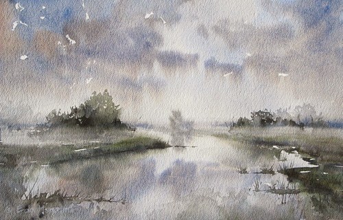
Lets make a fog, and a bit of a misty scenery. Maybe I must have chosen a smoother paper, but I did paint it on rough Saunders Waterford.
I used Ultramarine Blue, Burnt Sienna, Olive Green, and a bit of Neutral tint!
You see its in harmony, just like the one before, cause I use just a few colors.
Neutral tint is good to make a color darker, but not dirtier!
After the misty scene I was convinced I could do one more, well I could go forever, cause you can make endless mixes with color, and every painting would look different.
Take other paper, use other brushes, every time you change something, the outcome will be different!
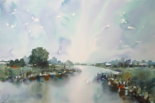
So I looked at my brushes, and there are a few flats, from three inch to just a quarter Inch.
My next painting will be made only with these! And I going to use fresh colors, so no red holding blues!
So in this one I used Winsor Blue, Sap-green, Cobalt Violet, and Raw and Burnt Sienna.
Immediately you can see the difference, this is fresher, and more colorful!
But still in Harmony, cause the big washes, are just three colors!
Note:
I didn’t looked at the photo for the last two watercolors , just made them by memory!
Just painting what is good for the watercolor, not looking for what is there, makes more interesting pictures!
Try to make a few watercolors from one subject, you can change colors, but also change the horizon lower or higher, or make this landscape with the paper on a different angle.
These were done all the same with the paper in landscape mode.
But you can also make this with the paper in portrait mode!
Good luck, but most of all have fun!!
Edo


Tanks!!!!
BeantwoordenVerwijderenA good reminder, Edo, that we are artists creating a painting, not copying what we see. I must try your process of painting the same scene from memory and using a different set of primary colors. Great learning idea. Thank you!
BeantwoordenVerwijderen