Often what happens with these sort of landmark buildings that you become to see a more beautiful side from it.
You see it in sunlight, and in rain, or in foggy mysterious light.
The last one appeals me most, and it is the fog that makes watercolors always more magical then other mediums.
With watercolor you have already the right medium to create mist, its wet and humid.
That's why it is shame you see so much watercolors that are totally missing the water.
The only water some painters use, is to get some color of there watercolor pans.
Or to mix two or more pigments on there palette.
I must say it takes courage to splash a lot of pigment and water on your paper, and also mix
the two or more pigments on the paper itself, but the reward is so much bigger when its succeed.
You come up with a bright and light watercolor, with vibrant colors, in this way even gray colors are transparent!
Now, when it comes to painting a good watercolor, you should, “must” make a sketch on forehand,
I was not a great believer in these kind of methods, and I found it a big waste of time.
But I am now a big fan of making these quick sketches, for color, tone and feel of the painting it is great!
I did have a picture from Tata Steel
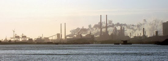
Which I made a bit more interesting in Photoshop

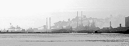
But the way to go is make it B&W and invent your own colors.
With a small Robert A. Wade trick, select the artistic filter Paint Daubs, and select the brush size what appeals you.
I know it is a sort of cheating maybe, but it can help beginning artist to overcome painting everything what is there.
This way you delete all the detail and clutter, and keep what you need for a good watercolor.
Lights and mid tones and darks are perfectly separated.
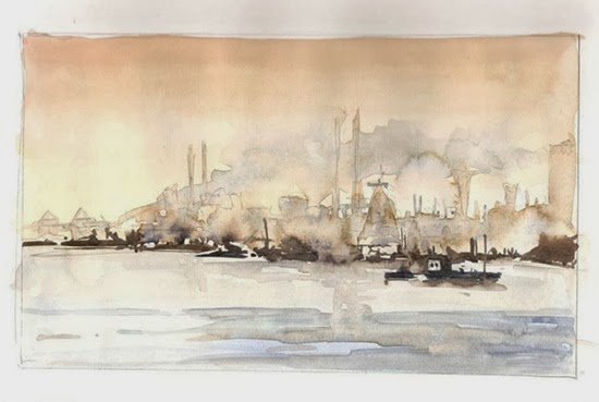
My first sketch, quick, maybe 10 minutes, with drying from a hairdryer.
Its loose, and I like the colors chosen already.
I tried a bigger one, on watercolor paper this time. I don’t like the result! Why is it a sketch always looks better?
The factory itself is okay, but it is too Blue, and too orange in the sky. Its a weird blob on the left above corner.
Tried to save it with white gouache, but it is hopeless. In this stage nothing will work.
Consider it as a learning moment, and when you have a few bad ones, the good one is not far away!
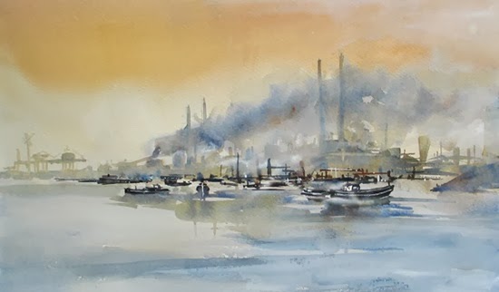
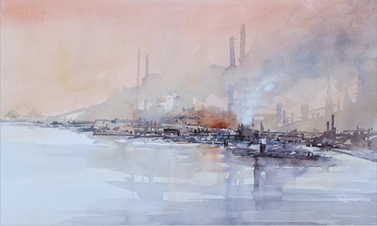
Well, after a few days, I did have another go, this time I am determined to keep soft edges!
Its more balanced and its softer in tone.
I must say, the salmon colored wash over the top part of the painting were done,
after I painted the first part of the factory, so it pushes the buildings even further away.
I did like the outcome now much more.
And then a unexpected event came on my path.
The Country Estate Beeckestijn did look for painters in the area, that have local art in there collection.
The exhibition would begin on the 24th of November and if you liked to participate you must send in
your artwork, that you think it is really local!
Well from 170 contestants they chose my watercolor, together with 100 other artist for this exhibit.

Paper is Bockingford 200Lbs half Imperial (Imperial size is 56x76 Cm)
Colors used are Ultramarine Blue, Raw Sienna, Permanent Rose, Burnt Sienna, White Gouache.
Edo Hannema


